Fire Storm: A Bold Display Font That Ignites Digital Headlines
It started with a hero section that felt… safe. Too safe. I was refreshing the homepage for a small creative coaching business—clean layout, thoughtful spacing, strong imagery—but the headline just sat there, polite and unmemorable. So I swapped in Fire Storm. Instantly, the energy shifted. Not louder—bolder. Not busier—more intentional. That’s when I knew this wasn’t just another display font. It was a visual spark plug.
What Fire Storm Brings to the Screen
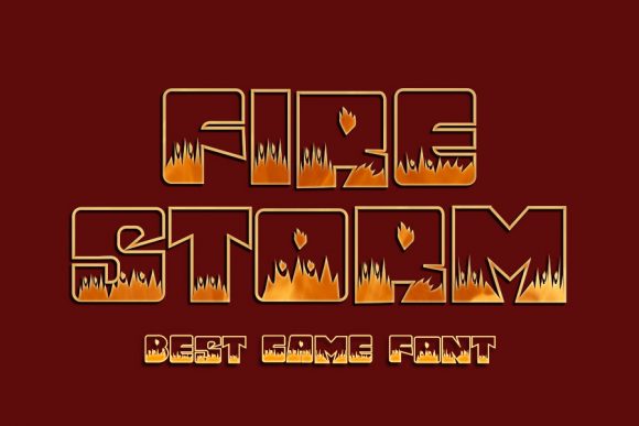
Fire Storm is a premium display font built for impact—not decoration. Its chunky letterforms have weight and presence without sacrificing clarity. Think of it as typography with posture: upright, confident, and grounded. The letters are tightly spaced but never cramped; the curves are generous, the corners sharp but not aggressive. It doesn’t whisper “creative”—it declares it. And unlike many bold display fonts, Fire Storm holds up beautifully at scale *and* at distance, whether you’re scanning a landing page on mobile or glancing at a banner on desktop.
Real-World Web Use: Where It Shines (and Where It Doesn’t)
I tested Fire Storm across six live contexts: a boutique online store banner, a course sales page headline, a portfolio site hero, a blog post header, a digital brand kit preview, and a campaign landing page CTA button. In every case, it elevated perceived professionalism—not by looking expensive, but by looking *certain*.
It excels in short, high-impact roles:
- Hero headlines — especially over textured backgrounds or subtle image overlays (the contrast pops without needing extra stroke or shadow)
- Section headings — like “How It Works” or “What You’ll Get”—where hierarchy needs instant recognition
- CTA buttons — at 24–32px on desktop and 20–26px on mobile, it reads cleanly even with minimal padding
- Logo lockups — paired with a neutral sans serif for the tagline, it creates memorable brand contrast
- Digital ad banners — its density ensures legibility at small sizes in feed-based placements
Where it steps back? Body copy, navigation menus, form labels, and anything under 18px. Fire Storm isn’t built for sustained reading—it’s built for stopping the scroll. That’s not a limitation; it’s purposeful design. Using it for paragraph text would undermine both its strength and your users’ experience.
Responsive Behavior & Readability Notes
On mobile, Fire Storm stays legible down to ~18px—but only when used as a single-line headline with generous line-height (1.2–1.3) and solid contrast against the background. I tested it over light, dark, and mid-tone image overlays: it performed best with a subtle text shadow (1px black at 30% opacity) on busy or gradient backgrounds. No heavy outlines needed—its inherent weight does the work.
One practical tip: avoid stacking multiple Fire Storm elements too closely in vertical rhythm. Because each letter carries visual mass, tight spacing between headlines and subheads can feel dense. I found 48–64px of margin-bottom after a Fire Storm heading gave breathing room while preserving momentum.
Smart Pairing for Digital Harmony
Fire Storm thrives in contrast. My go-to pairing is a warm, humanist sans serif—think Inter, Poppins, or even a well-hinted version of Helvetica Neue—for all supporting text. The clean geometry of the sans grounds Fire Storm’s expressive energy and supports accessibility without compromise. For editorial-style sites (like a writer’s portfolio or creative blog), I’ve successfully paired it with a restrained serif—such as Lora or Literata—for pull quotes or bylines. The key is balance: Fire Storm leads; the secondary font listens.
Avoid pairing it with other decorative fonts—especially scripts or handwritten styles—unless you’re intentionally crafting a highly stylized, one-off campaign graphic. On live websites, cohesion matters more than flair.
Licensing, Formats & Practical Checks
Before dropping Fire Storm into a client site or your own shop, verify three things: First, that the license includes webfont usage (WOFF2 support is ideal for performance). Second, that it ships with at least one solid weight—no thin variants needed, but a bold or black weight adds flexibility. Third, check multilingual character coverage if your audience spans beyond English (basic Latin-1 is standard, but accented characters matter for real-world use).
I also recommend testing the font files in your build pipeline—some display fonts include unnecessary stylistic alternates or ligatures that bloat load time. Fire Storm kept things lean: one OTF and one WOFF2, no hidden extras. And yes—it’s fully compatible with Figma, Webflow, and Shopify’s theme editor, with no rendering hiccups across Chrome, Safari, or Firefox.
Fire Storm won’t solve weak messaging or poor UX—but it will make strong messaging impossible to ignore. It’s the kind of display font that reminds you why typography still matters in a world of templates and AI tools: because real connection starts with how words *feel* before they’re even read.